


December 10, 2022 - By Emily Becker - As our regular readers will be very aware, La Niña has been rolling along in the tropical Pacific for many months, and our third La Niña winter in a row is under way. La Niña is the cool phase of the El Niño-Southern Oscillation (“ENSO” for short) climate pattern. The current forecast is for La Niña to continue into the winter, with 50-50 chances for La Niña and neutral in the January–March average.
Conditions in the tropical Pacific ocean-atmosphere system have been consistent with La Niña for long enough that, in November, one of our frequent readers commented—accurately—that they might as well have just re-read the October post! However, while La Niña seems stuck in a rut right now, the last thing we want is to give the impression that ENSO is boring! So this month, I’ll do a quick recap of current conditions before looking into a question I’ve been curious about for a while now: how does ENSO affect daily temperatures during winter?
Current events
The sea surface temperature in the tropical Pacific is still well within La Niña territory, at about 0.9 °C cooler than the long-term average in November, according to ERSSTv5, our favorite sea surface temperature dataset. This anomaly—the difference from the long-term average—has been gradually warming up over the past few months, since reaching -1.1 °C in September.
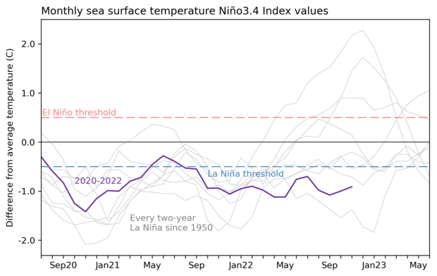
Three-year history of sea surface temperatures in the Niño-3.4 region of the tropical Pacific for the 8 existing double-dip La Niña events (gray lines) and the current event (purple line). Of all the previous 7 events, 2 went on to La Niña in their third year (below the blue dashed line), 2 went on to be at or near El Niño levels (above the red dashed line) and three were neutral. Graph by Emily Becker based on monthly Niño-3.4 index data from CPC using ERSSTv5.
The atmosphere also continues to reflect La Niña’s amped-up Walker circulation, with more rain than average over Indonesia, drier-than-average conditions over the central Pacific, and stronger winds, both near-surface and high in the atmosphere, all observed during November. The near-surface winds—the east-to-west trade winds—fluctuated a bit, slowing a little in mid-November. Since these winds cause upwelling, their slow-down may have contributed to the slight weakening in the sea surface temperature anomaly.
What’s next?
Forecasters are very confident that La Niña will continue in the short term, followed by a transition to neutral conditions. The exact timing of the transition is not clear, with equal chances of both La Niña and neutral for the January–March average. Confidence that La Niña will have exited by the February–April period, however, is fairly high, with a 71% chance of neutral. This forecast indicates that we can expect La Niña to influence our winter climate conditions this year. Check out the September post for a round-up of La Niña’s typical effects on winter temperature, rain and snow, and other weather and climate.
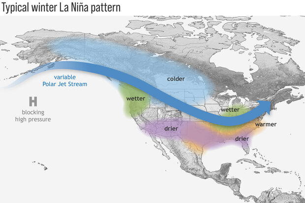
During La Niña, the Pacific jet stream often meanders high into the North Pacific. Southern and interior Alaska and the Pacific Northwest tend to be cooler and wetter than average, and the southern tier of U.S. states—from California to the Carolinas—tends to be warmer and drier than average. Farther north, the Ohio and Upper Mississippi River Valleys may be wetter than usual. Climate.gov image.
Speaking of La Niña impacts…
When we talk about the expected La Niña influence on seasonal temperature, we almost always talk about how the seasonal average is shifted during ENSO events. For example, during La Niña, winter in the northern U.S. tends to be cooler than average. The seasonal average temperature is very important, with implications for the amount of energy used for heating, and so on. Also, looking at seasonal averages means that we are filtering out short-term fluctuations and can be more confident that the shifts in climate are truly linked to ENSO.
However, you and I generally experience weather from a day-to-day perspective. We’ll notice big shifts in temperature from one day to the next, or unusually warm or cold days. To get an idea of how ENSO affects daily temperatures, I’ll start by looking at the range of daily average temperature within each winter. How much does the temperature normally vary from day to day? Then we can ask, for example, do La Niña winters have a wider range of daily temperatures in some locations than average? Narrower? No change? This is just a starting place, but we have to start somewhere!
The footnote has details about the calculations and data I used for the maps I show below. Also, I’m far from the first person to look at ENSO’s impact on daily characteristics of temperature, of course, and the footnote includes some information on earlier studies.
Free range
The standard deviation is a common statistic to understand the spread of a set of numbers. For example, if most of your daily winter temperatures occur in the range of 40–50 °F, the standard deviation will be smaller than if most of your daily temperatures are in the range of 35–55 °F, even though the average temperature may be the same at both locations. This statistic is widely employed in weather and climate science, and it’s what I use here.
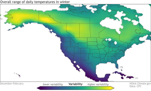
The average variability of daily temperatures within winter. Yellow regions show where the range of daily temperatures in winter is greatest, while blue shows regions with the narrowest range. The range is assessed using the standard deviation of daily mean temperature averaged over all winters (December–February), 1950–2019. Daily temperature data source is Berkeley Earth. Map by climate.gov based on analysis by Emily Becker.
First, let’s see what the typical range of daily winter temperature is across North America. The central regions of the continent have the greatest variability on average, while the Pacific coast has a relatively narrow range of daily winter temperatures, modulated by the nearby ocean. The very moist climate of the tropics features the least daily variability.
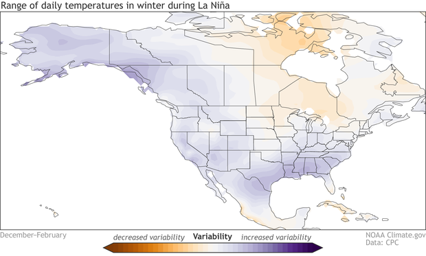
The difference in the range of daily temperatures in La Niña winters compared to the long-term average (1950–2019). Purple indicates where the variability of daily temperature is greater in La Niña winters than average. Temperature data from Berkeley Earth. Map by climate.gov based on analysis by Emily Becker.
La Niña winters tend to feature a wider-than-average range of daily temperatures across most of the continent, with the exception of the Canadian provinces around the Hudson Bay, southern Mexico, and the Caribbean. The geographic extent of this pattern surprised me, as I would have expected it to be more localized, like the seasonal average patterns. The greatest increase in daily variability during La Niña is along the Gulf Coast.
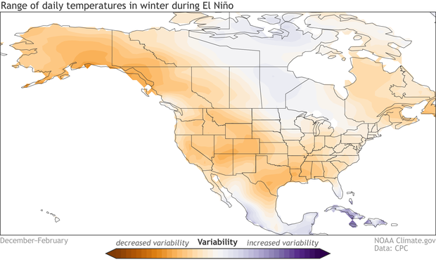
The difference in the range of daily temperatures in El Niño winters compared to the long-term average (1950–2019). Orange indicates where the variability of daily temperature is lower in El Niño winters than average. Temperature data from Berkeley Earth. Map by climate.gov based on analysis by Emily Becker.
El Niño’s effect on the range of daily temperatures in winter is generally opposite to La Niña’s, with mostly decreased variability when compared to average, especially across the western half of North America.
Overall, I think this is an interesting result: La Niña makes daily temperatures in winter more variable in most places, and El Niño makes them less variable. But it presents an incomplete picture, of course. These maps show the average changes during El Niño and La Niña—to understand how consistent this effect is, we could illustrate each winter separately like in Nat’s post last month that shows every winter’s precipitation and temperature patterns. What does a wider range of daily average temperature really mean? Why are we seeing these patterns? Would we expect to see the same patterns in the daily high or daily low temperature? These and other questions will have to wait for future posts…
Footnote
Details on the analysis:
- ENSO criteria: Any year with the December–February Oceanic Niño Index (ONI) greater than 0.5 °C was included in the “El Niño” sample, and any year with ONI less than -0.5 °C was included in La Niña. Not including ONI equal to 0.5 °C or -0.5 °C means I excluded the very weakest events, as well as borderline not-quite-ENSO years.
- The El Niño maps show the standard deviation averaged over the resulting 20 El Niño winters divided by the overall average winter standard deviation. The La Niña maps show the average during the 18 La Niña winters divided by the overall winter average.
- Daily temperature data: I used Berkeley Earth daily average temperature dataset. It’s also available here.
- Years included: 1950–2019. Berkeley Earth is available through near-present, but the data I downloaded ended in 2019. I’ll update with 2020–2022, but don’t expect the overall results to change.
- Programming language: I used Python. Jupyter notebook available upon request.
- Earlier studies: The most cited paper on this topic is Smith and Sardeshmukh 2000. My results mostly reproduced theirs, with the expected differences because we used different temperature data, they looked at 1959 to 1998, and we even had different criteria for defining ENSO events. Also, there’s a recent study, Yang et al. 2022 (Nat is a co-author) that my results agree with. I’m going to discuss that paper a little more next month… stay tuned!
A blog about monitoring and forecasting El Niño, La Niña, and their impacts.
Disclaimer:
The ENSO blog is written, edited, and moderated by Michelle L’Heureux (NOAA Climate Prediction Center), Emily Becker (University of Miami/CIMAS), Nat Johnson (NOAA Geophysical Fluid Dynamics Laboratory), and Tom DiLiberto and Rebecca Lindsey (contractors to NOAA Climate Program Office), with periodic guest contributors.
Ideas and explanations found in these posts should be attributed to the ENSO blog team, and not to NOAA (the agency) itself. These are blog posts, not official agency communications; if you quote from these posts or from the comments section, you should attribute the quoted material to the blogger or commenter, not to NOAA, CPC, or Climate.gov.
Source: ENSO blog team