


February 13, 2023 - By Emily Becker - La Niña—the cool phase of the El Niño-Southern Oscillation climate pattern—weakened over the past month, and forecasters expect a transition to neutral conditions in the next couple of months. We’ll check in with the tropical Pacific to see how things are going before continuing the journey into understanding winter daily temperature variability that I started in December’s post.
Current events
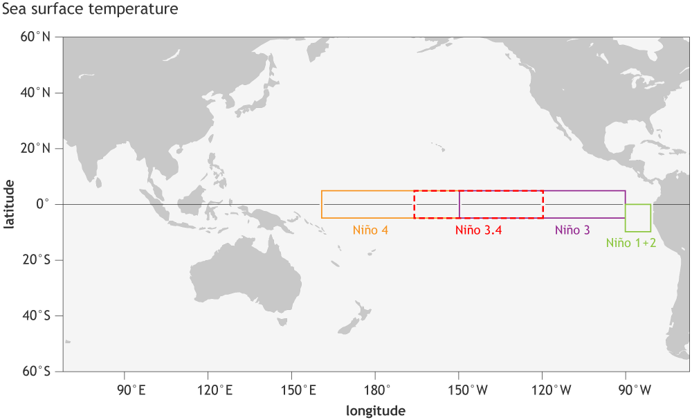
The sea surface temperature in the Niño-3.4 region in the tropical Pacific came in at 0.75 °C (1.4 ˚F) cooler than the long-term average in January according to ERSSTv5, our most consistent historical dataset.
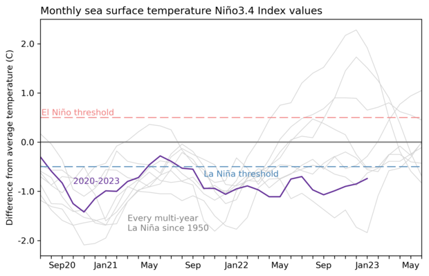
Three-year history of sea surface temperatures in the Niño-3.4 region of the tropical Pacific for the 8 existing multi-year La Niña events (gray lines) and the current event (purple line). Of all the previous 7 events, 2 went on to La Niña in their third year (below the blue dashed line), 2 went on to be at or near El Niño levels (above the red dashed line) and three were neutral. Graph by Emily Becker based on monthly Niño-3.4 index data from CPC using ERSSTv5.
This is the second month in a row with that the Niño-3.4 anomaly (anomaly = ”difference from the long-term average”) has weakened, but it still exceeds the La Niña threshold of -0.5 °C. The most recent weekly Niño-3.4 anomaly, which comes from the OISST dataset, was just at that threshold, measuring -0.5 °C. (Take a look at Tom’s post for more details on the various datasets we use to track temperatures in the Pacific.)
Weekly measurements tend to bounce around (weather!), while ENSO is a seasonal pattern (climate!). Therefore, we won’t declare La Niña is over the moment the weekly value crosses the threshold—we’ll wait to be sure that the monthly average anomaly is in the neutral range (between -0.5 °C and 0.5 °C). The last time neutral conditions were present was summer 2021.
The atmospheric response to La Niña’s cooler-than-average ocean surface is an amped-up Walker circulation: stronger trade winds, stronger westerly (west-to-east) winds high up in the atmosphere, more rain and clouds than average over the far western Pacific, and drier conditions over the east/central Pacific. All of these characteristics were evident through January, indicating that the atmosphere is still reflecting La Niña.
What’s next??
Okay, okay, so La Niña is still here. But forecasters expect that a change is imminent, with an 85% chance that the February–April period will be neutral. This is based on the consensus of our computer models and bolstered by some physical observations, including the weakening oceanic anomalies at the surface and subsurface.
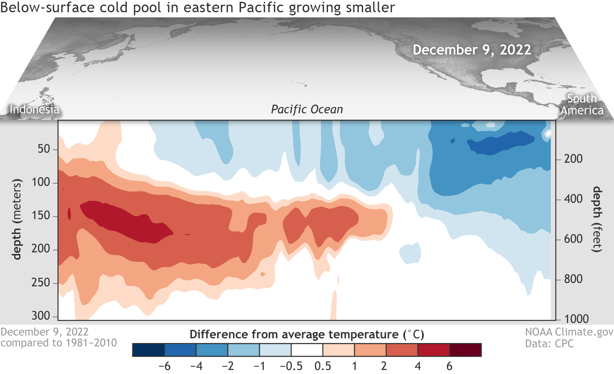
Water temperatures in the top 300 meters (1,000 feet) of the tropical Pacific Ocean compared to the 1991–2020 average in December–January 2022–23. NOAA Climate.gov animation, based on data from NOAA's Climate Prediction Center.
The subsurface provides a source for the surface. If there were still a lot of cooler water under the surface, we might be more hesitant to conclude that the transition to neutral conditions would happen soon. But as the animation above shows, the cold pool is getting smaller.
But will the neutral conditions we expect for spring precede an El Niño?? Tell us what we really want to know! Currently, El Niño has odds of about 60% for next fall—and after three La Niña winters in a row, it might seem inevitable—but there are some factors that provide uncertainty. There’s our old friend, the spring predictability barrier. Forecasts made in the spring tend to have lower accuracy, at least in part because spring is a time of transition for ENSO (other possible factors are still being explored), making it harder for models to get a grip on what direction things are going.
Also, the wide range of potential outcomes from the models (shown below) tells us that there is still a lot of uncertainty.
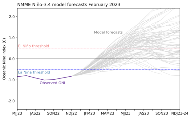
February 2023 climate model forecasts for the Niño-3.4 temperature anomaly in 2023 from the North American Multi-Model Ensemble (NMME). Each gray line shows an individual potential outcome. Purple line shows the observed Oceanic Niño Index. Graph by Emily Becker.
Each line in that graph shows a possible scenario for next fall and winter. The scenarios begin to diverge for two main reasons: the differences in how each model simulates certain small-scale physical processes and, for a given model, the very-slightly-different starting input that accounts for the fact that we can never observe the current state of the climate system perfectly. The predictions span from strong El Niño to (gasp!) a 4th-year La Niña. These extreme scenarios are unlikely, though, and the majority of the forecasts are in the neutral to moderate-El Niño range. More on climate models in this post.
In summary: La Niña is waning, and confidence is high that neutral conditions will be in place soon and will last through the spring and early summer. Chances for El Niño next fall are increasing, but we’ll have a better picture as we progress through and past the spring predictability barrier.
Daily temperature variability or bust!
To recap: over the last couple of posts, I’ve been looking into how ENSO affects the range of daily temperatures within a season. When it comes to ENSO impacts, we usually talk about the seasonal average temperature, but—as vividly illustrated by the two extreme cold-air outbreaks in the U.S. this winter—daily temperature is how we experience weather. So I examined the variability or range of daily temperature each winter over 1950–2020 and then checked if the range of variability was different in El Niño winters or La Niña winters compared to neutral winters. Details of my analysis are in the footnotes.
In December, I showed that the range of daily average temperature is wider during La Niña winters than during El Niño winters in nearly all of North America. The only geographic exceptions are the north-central region of the continent, Florida, and southern Mexico, all of which have lower variability during La Niña and higher variability during El Niño winters.
Then, in January, I checked out the average range of daily minimum and maximum temperatures. It turned out that there is a very wide range of daily minimum temperatures (usually the overnight low temperature) in the center of the continent, with less variability toward the coasts, especially the Southwest. Looking at daily maximums (usually the daytime high), we found that there was less variability overall than with the minimum, except for the subtropical regions.
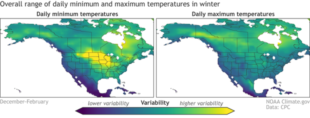
The average variability of daily low temperatures (left) and high temperatures (right) within winter. Yellow regions show where the range of daily temperatures in winter is greatest, while blue shows regions with the narrowest range. The range is assessed using the standard deviation of daily low or high temperature averaged over all winters (December–February), 1950–2020. Daily temperature data source is Berkeley Earth. Map by climate.gov based on analysis by Emily Becker.
Breaking down the patterns into ENSO phase, the first thing we can say is that El Niño and La Niña have approximately opposite effects on both daily maximum and daily minimum, much as they did on the average temperature variability I showed in December. Where El Niño reduces variability, La Niña increases it, and vice-versa.
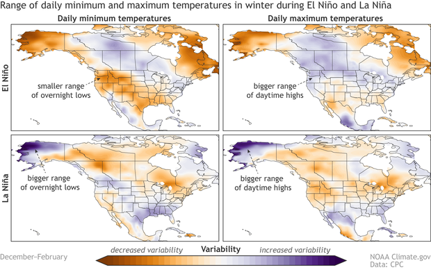
The difference in the range of daily minimum and maximum temperature in El Niño winters (upper row) and La Niña winters (lower row), compared to the long-term average. Purple shows where the variability of daily highs or lows is greater, while orange shows where the range is reduced. For example, during El Niño winters, the range of daily low temperatures is lower than average in Alaska, while it is increased during La Niña winters. Long-term average is 1950–2020. Temperature data from Berkeley Earth. Map by climate.gov based on analysis by Emily Becker.
However, things are a little noisier than those average daily patterns were. This is expected; any time you get into more granular data—whether you’re talking about area or time span—your results get noisier. (Another example of this is the weekly vs. monthly sea surface temperature I talked about above.) I’ll make a few quick observations about these maps but leave you to compare them for your hometown or other areas of interest.
Looking first at the maps for La Niña winters, we find that much of the U.S. and Alaska experience an increased range of daily lows. The pattern of La Niña’s impact on the daily high temperature range is somewhat different, with variability decreasing in the northern half of the U.S. and increasing in the Southeast. However, there are some regions where both daily highs and daily lows change the same way during La Niña winters (increased range in the Southeast and in Alaska).
During El Niño, the range of daily low temperature is substantially reduced across most of the U.S. and Alaska. The range of daily highs, however, is slightly expanded or only slightly reduced over the U.S.
That’s all there’s space for this month. What ideas do you have for why these patterns vary the way they do? Let us know in the comments! Then next month, I’ll wrap things up with some explanations and thoughts about ENSO’s impact on daily temperature. Until then, stay cozy!
Footnote
Details on the analysis:
- The maps show the standard deviation of daily maximum or minimum temperature for each winter averaged over all winters 1950–2020 and the averages for La Niña and El Niño winters, as determined by the Oceanic Niño Index.
- Daily temperature data: I used Berkeley Earth daily average temperature dataset. It’s also available here.
- Years included: 1950–2020. Berkeley Earth is available through near-present, but the data I downloaded ended in 2020. I’ll update with 2021–2022, but I don’t expect the overall results to change.
- Programming language: I used Python. Jupyter notebooks available upon request.
A blog about monitoring and forecasting El Niño, La Niña, and their impacts.
Disclaimer:
The ENSO blog is written, edited, and moderated by Michelle L’Heureux (NOAA Climate Prediction Center), Emily Becker (University of Miami/CIMAS), Nat Johnson (NOAA Geophysical Fluid Dynamics Laboratory), and Tom DiLiberto and Rebecca Lindsey (contractors to NOAA Climate Program Office), with periodic guest contributors.
Ideas and explanations found in these posts should be attributed to the ENSO blog team, and not to NOAA (the agency) itself. These are blog posts, not official agency communications; if you quote from these posts or from the comments section, you should attribute the quoted material to the blogger or commenter, not to NOAA, CPC, or Climate.gov.
Source: ENSO blog team

