


March 1, 2021 - Author: Nat Johnson - We are rapidly approaching the end of the meteorological winter, and it has been quite a finish for much of the United States, especially for those who have suffered the devastating effects of recent extreme cold. As discussed on this blog, we have been in the grips of a healthy La Niña, but the weather outside of the tropics often hasn’t behaved as we would expect for La Niña, even before this period of extreme cold and winter storms. In this post, we’ll investigate what was going on for the first two-thirds of this winter.
Feeling the pressure
As Emily mentioned back in January, the early winter temperature pattern over North America looked more like a typical El Niño than what we would expect from a moderate-to-strong La Niña. This unexpected temperature pattern resulted from shifts in the jet stream that we usually don’t see during La Niña. Forecasters and scientists often evaluate the large-scale atmospheric circulation using pressure about three miles above the earth’s surface, the so-called 500 hectopascal (hPa) or, equivalently, the 500 millibar (mb) level (1). When we view the average pattern that occurred across the Northern hemisphere in December – January, we see a broad area of lower pressure extending from northeast Asia across the North Pacific into southwest Alaska as well as a strong area of higher pressure over northeast Canada and Greenland.
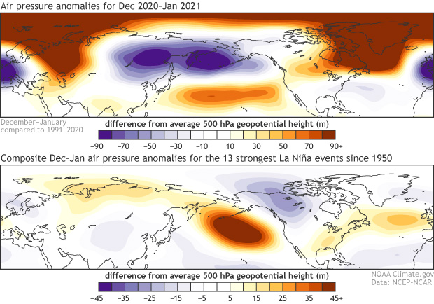
(Top) Geopotential height anomalies (m) at the 500 hectopascal (hPa) pressure level during December 2020 through January 2021. Cold colors indicate below-average atmospheric pressure and warm colors indicate above-average atmospheric pressure at a level about three miles above the Earth’s surface. (Bottom) The average 500 hPa geopotential height anomalies from December – January for the 13 strongest La Niña episodes since 1950, including December 2020 through January 2021. Note the different scaling between the top and bottom figures. The top figure has a wider range of values because the top figure includes contributions from both predictable signals, like La Niña, and random weather variability, whereas the bottom figure has filtered out most of the random weather variability. Anomalies are calculated with respect to the 1991-2020 base period for the top figure and with 30-year base periods updated every 5 years (see here for a description). NOAA Climate.gov figure with NCEP/NCAR Reanalysis data obtained from the NOAA Physical Sciences Laboratory.
The map in the bottom panel shows the average December – January pressure pattern for the 13 strongest La Niña episodes since 1950 (2), including the current episode. Typically, La Niña brings anomalous high pressure over the North Pacific, low pressure over northwestern North America, and high pressure to the southeast U.S., a pattern referred to as the negative phase of the Pacific-North American (PNA) pattern. This pattern generally brings cooler-than-average conditions over much of Canada and the northern US and warmer-than-average conditions across much of the southern U.S., but clearly the atmosphere had different ideas this past December and January.
Par for the course?
Was the mismatch that we saw in December-January really that unusual? We know from previous blog posts (like this one) that the atmosphere varies quite a bit from one La Niña to the next, and the atmosphere never fully resembles the average of all events. To address this question, I evaluated the similarity between the individual December-January 500 hPa maps and the average La Niña pattern (for the 13 moderate-to-strong La Niña episodes). For this calculation, I use the pattern correlation, a metric that summarizes the similarity in a single number: a value of 1 means perfect match, 0 means complete mismatch, and -1 means mirror opposites (3).
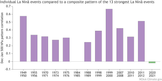
Pattern correlations between the individual La Niña and average La Niña December – January 500 hPa geopotential height anomalies north of 15°N for the 13 strongest La Niña episodes since 1950. Positive values indicate at least some degree of pattern matching, with 1 indicating a perfect match, and negative values indicate a mismatch between the two patterns. NOAA Climate.gov figure with NCEP/NCAR Reanalysis data obtained from the NOAA Physical Sciences Laboratory.
The pattern correlations are usually substantially positive for moderate-to-strong La Niñas, which indicates that most events share some basic similarity with the average La Niña pattern. This confirms that La Niña is a reliable source of predictability outside of the tropics (and a big reason that we have an ENSO Blog!). However, the pattern correlation for the December 2020 – January of 2021 is the lowest of the 13 events and is actually slightly negative. That means you can argue that the Northern Hemisphere atmosphere looked a little more like El Niño than La Niña!
Early clues or whimsical butterflies?
So far, our calculations confirm that there was an unusual mismatch between the actual and typical La Niña atmospheric circulation pattern. Was this mismatch due to some competing influence that we should have been able to anticipate? Did the forecasters miss something? Or was the mismatch due to chaotic weather variability that we cannot predict well in advance? This is the question that forecasters and research scientists grapple with and often agonize over time and time again.
Our dynamical prediction models might provide some clues to address whether there may have been a competing influence (4). These models provide seasonal forecasts that, in principle, incorporate all sources of predictability, not just ENSO (but all models have errors!). For this analysis, I use a new prediction model from the NOAA lab in which I work, the Geophysical Fluid Dynamics Laboratory (GFDL), called SPEAR (5). SPEAR is the newest member of the North American Multi-Model Ensemble (NMME), making its real-time debut in early February. Here, I analyze one of the SPEAR test predictions from early November of 2020 (6).
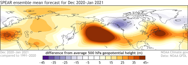
The predicted 500 hPa geopotential height anomalies (m) for December 2020 through January 2021 from the ensemble average of 30 SPEAR dynamical model forecasts issued in early November of 2020. NOAA Climate.gov figure with SPEAR data obtained from the NOAA Geophysical Fluid Dynamics Laboratory.
As is always the case for seasonal predictions, and as Emily eloquently described in this post, SPEAR is run many times (30 to be exact) with slightly different initial conditions (think different flaps of a butterfly’s wings). Individual forecasts (ensemble members) diverge rapidly due to the inherently chaotic nature of the climate system, but the average of those 30 ensemble members filters out that chaotic variability and provides an estimate of the predictable signal. The ensemble average December – January pressure pattern predicted by SPEAR in early November looks a lot like the average La Niña pattern. This indicates that according to SPEAR, the typical Northern Hemisphere response to La Niña was the best prediction forecasters could have made at least a month in advance, even though it did not occur.
So, then what about the role of chaotic weather variability? This would include influences of phenomena like the Madden-Julian Oscillation and sudden stratospheric warmings that clearly influence our weather but that are difficult or impossible to predict more than a few weeks in advance. It’s very difficult to come up with a definitive answer, but we can get more clues from the diversity within the 30 SPEAR ensemble members. Remember, all 30 members are run under nearly identical conditions except for tiny perturbations in the initial conditions that reflect our imperfect knowledge of the climate state. We can examine the distribution of pattern correlations between the actual and individual forecast December – January 500 hPa maps.
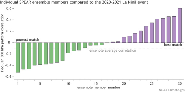
Pattern correlations between the individual SPEAR ensemble member forecasts and the observed December 2020 – January 2021 500 hPa geopotential height anomalies north of 15°N for SPEAR forecasts issued in early November 2020. Higher pattern correlations indicate better forecast performance. The dashed red line indicates the pattern correlation between the ensemble average and the observed geopotential height field. NOAA Climate.gov figure.
We see quite a wide range of pattern correlations, both negative and positive, indicating that some ensemble members do a very poor job and others do reasonably well. If we look at the ensemble member with the highest pattern correlation, we see a lot of similar features to what actually occurred, including a broad area of low pressure in the North Pacific that is opposite to what we expect during La Niña. Remember, this reasonably accurate ensemble member outlier comes from the exact same model that said the best bet was for a typical La Niña pattern! Again, the only things that distinguish this high-performing ensemble member from the low-performing ensemble members are tiny perturbations in the initial conditions roughly equivalent to flaps of butterfly wings. Did I mention that seasonal prediction is tough?
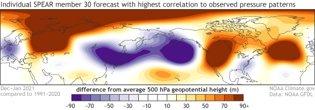
The predicted December 2020 through January 2021 500 hPa geopotential height anomalies (m) for the SPEAR ensemble member with the highest pattern correlation with the observed pattern. NOAA Climate.gov figure with SPEAR data obtained from the NOAA Geophysical Fluid Dynamics Laboratory.
Please note that this does not prove that chaotic weather variability is a primary culprit for the mismatch. It’s certainly possible that other factors were at play, and our forecast models may not be capturing all important sources of seasonal predictability, such as stratospheric-tropospheric interactions (7). The main point of this analysis is that it’s very challenging to rule out the influence of chaotic weather variability, and underscores why our seasonal forecasts are always issued in terms of probabilities.
So, you may be wondering what this means for NOAA’s Winter Outlook that was first issued last October. Keep in mind that this outlook covers the full three months of meteorological winter, and I don’t have to tell our U.S. readers that February brought some big weather changes that I haven’t covered here. Stay tuned for next month’s post when Tom returns to give us a complete breakdown of NOAA’s 2020-2021 Winter Outlook!
Footnotes
- Technically, we evaluate geopotential height anomalies on a surface of constant 500 hPa pressure, a level that splits atmospheric mass roughly in half (half below and half above). So, the atmospheric pressure is actually constant on this surface, and the geopotential height anomalies tell us how high above the earth’s surface we must go to reach that level, but we still can think of it as representing pressure patterns on a surface of constant height about three miles above the earth’s surface.
- I identified 13 episodes by considering all cases when the November – January Niño 3.4 sea surface temperature was more than 1°C below average. This criterion includes moderate and strong La Niña episodes.
- Hat tip to David Margolin, who leads a Subseasonal Forecast Contest for meteorology students and who did a similar calculation that inspired this analysis.
- The sort of analysis I describe here is called “attribution.” The NOAA Climate Prediction Center regularly conducts more thorough analysis and attribution of seasonal climate anomalies in near real-time, which can be found here.
- “SPEAR” is an acronym that stands for Seamless System for Prediction and EArth System Research. In February of 2021, SPEAR replaced the previous two GFDL seasonal prediction models, FLOR and CM2.1, in the North American Multi-Model Ensemble. In addition to real-time seasonal forecasts, SPEAR is designed for studies of seasonal to multidecadal climate prediction and projection.
- I chose the early November test forecast because it is close enough to the winter season that the slowly evolving sources of predictability, like ENSO, are very similar in all 30 SPEAR ensemble members but far enough from the winter season that the influence of quickly evolving sources of predictability from the atmosphere (the “weather noise”) has little effect on the forecast. I want to remove the influence of these quickly evolving atmospheric processes that are rooted in how the model initializes the atmospheric state because I am interested in the longer-range sources of predictability that we can anticipate months in advance. The choice of November also has a practical advantage because, in principle, it is early enough that the NOAA Climate Prediction Center would be able evaluate such a forecast before their November update to the Winter Outlook.
- The current version of SPEAR that is participating in the NMME has 33 vertical levels, mostly in the troposphere, which are insufficient to capture all important interactions between the troposphere and stratosphere. Future prediction models may include more atmospheric levels to improve the predictability of stratospheric-tropospheric interactions, including sudden stratospheric warming events. This is an area of active research and development.
A blog about monitoring and forecasting El Niño, La Niña, and their impacts.
Disclaimer:
The ENSO blog is written, edited, and moderated by Michelle L’Heureux (NOAA Climate Prediction Center), Emily Becker (University of Miami/CIMAS), Nat Johnson (NOAA Geophysical Fluid Dynamics Laboratory), and Tom DiLiberto and Rebecca Lindsey (contractors to NOAA Climate Program Office), with periodic guest contributors.
Ideas and explanations found in these posts should be attributed to the ENSO blog team, and not to NOAA (the agency) itself. These are blog posts, not official agency communications; if you quote from these posts or from the comments section, you should attribute the quoted material to the blogger or commenter, not to NOAA, CPC, or Climate.gov.
Source: ENSO blog team