


March 26, 2022 - By Tom DiLiberto - Some would call it the most famous annual March tradition. No, I’m not talking about March Madness, or St. Patrick’s Day. I’m talking about our annual look back at the Climate Prediction Center’s Winter Outlook to see how well it did.
Warning: Some math will follow. At the ENSO Blog, we’re not the types to simply give you a thumbs up or thumbs down on how well the outlook performed. That leaves us vulnerable to the whims of our human biases. Instead, we slam some cold, hard statistical math facts on the proverbial table for our readers. If you’d like a refresher, there are seven different verification posts at the ENSO Blog that I’ve written that I highly recommend you peruse.
A reminder of the basics: The seasonal outlooks are forecasts for the probability that seasonal average temperature and total precipitation will fall in one of three categories—above average, below average, or near average. The classic Winter Outlook map that you are accustomed to is showing only the category that has the highest chance of the three. If all chances are the same (called an equal chance), the location is colored in white (1). Due to the high amount of uncertainty, you should never expect a seasonal outlook forecast to have probabilities close to 100% in any of the individual categories (2). That would be weird.
Onto the Winter Outlook 2021-2022 verification! (3)
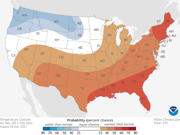
Places where the forecast odds favor a much colder than usual winter (blue colors) or much warmer than usual winter (red), or where the probability of a cold winter, a warm winter, or a near-normal winter are all equal (white). The darker the color, the stronger the chance of that outcome (not the bigger the departure from average). Click here for a version that includes Alaska. Click here for a text-only discussion for Hawaii. NOAA Climate.gov map, based on data from NOAA CPC.
Winter 2021-2022 temperature outlook verification: How’d all that red do?
The Winter Outlook favored warmer-than-average temperatures for the eastern, southern, and central United States. Meanwhile temperatures were favored to be below-average across the Pacific Northwest and northern Plains. This north/south split on temperatures is similar to the pattern that is expected during a La Niña-influenced winter. So that is right in line with expectations for this year, which was the second consecutive winter with La Niña conditions in the Pacific.
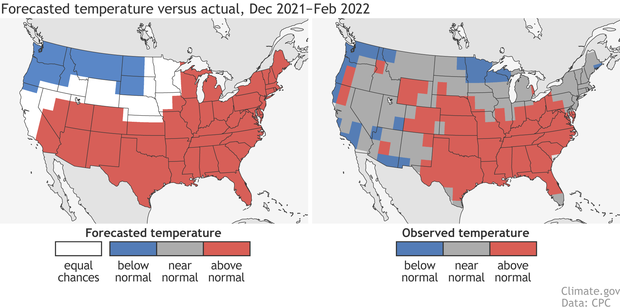
(left) Temperature forecast for December-February 2021-22, made in mid-November. The colors show the forecast category with the highest probability. White areas are where all three outcomes (warm, cool, or average) were equally likely (each had a 33.3% chance of happening). (right) Observed temperature category for December-February 2021-22. Climate.gov image based on CPC data.
Reality wasn’t too far off. Above-average temperatures were observed across the Southeast, southern/central Plains, Midwest, and Mid-Atlantic, with below-average temperatures recorded in the Pacific Northwest, Minnesota/Wisconsin and localized areas in southern California and Arizona.
The biggest differences were over the Northeast and Southwest, where temperatures were near-normal to below-normal, and not above as favored.
But a good scientist never just uses their eyes in verifying a forecast. Instead, they use an objective verification metric to take a deeper look at exactly how things went. At the Climate Prediction Center, the verification metric known as the Heidke Skill Score (HSS) is often used (available here for all NOAA seasonal outlooks).
The HSS compares how often the outlook hit or missed the mark with how often the forecast would have been right just by luck. A HSS value that is greater than zero means that the outlook was better than just tossing a three-sided die across the table and picking a category. The better the forecast, the higher the HSS. (4)
The HSS for the 2021-2022 winter temperature outlook was 21 for the contiguous United States which rose to 26 if we only looked at areas where forecasters favored one category over the others (aka only areas that weren’t forecast for equal chances). This number is well above zero, indicating that the outlook was better than a random forecast. Woo-hoo!
How does that compare to past outlooks? While two of the last four years had negative HSSs, looking more broadly, the temperature outlook scored a HSS above zero in eight of the last ten and 16 of the last 20 years. We’ve mentioned on the ENSO Blog in the past that seasonal outlooks are all about playing the “long game” and not overly focusing on how one year does compared to the last. The proof is in the long-term pudding.
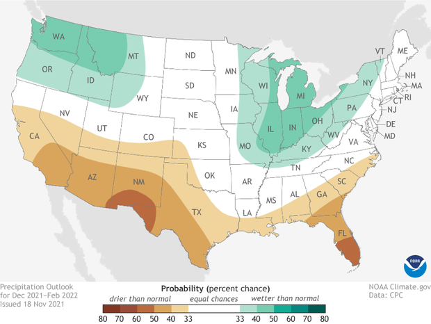
Places where the forecast odds favor a much drier than usual winter (brown colors) or much wetter than usual winter (blue-green), or where the probability of a dry winter, a wet winter, or a near-normal winter are all equal (white). The darker the color, the stronger the chance of that outcome (not the bigger the departure from average). Click here for version that includes Alaska. Click here for a text-only discussion for Hawaii. NOAA Climate.gov map, based on data from NOAA CPC.
Winter 2021-2022 Precipitation outlook verification: A tale of dry and wet
The 2021-2022 winter precipitation outlook split the country into two halves. The southern tier of the United States was favored to observe a drier-than-average winter, while much of the northern tier (outside the northern central plains) was favored to record a wetter-than-average season. Like the temperature outlook, the precipitation outlook also bears a close resemblance to the impacts normally seen during a La Niña winter.
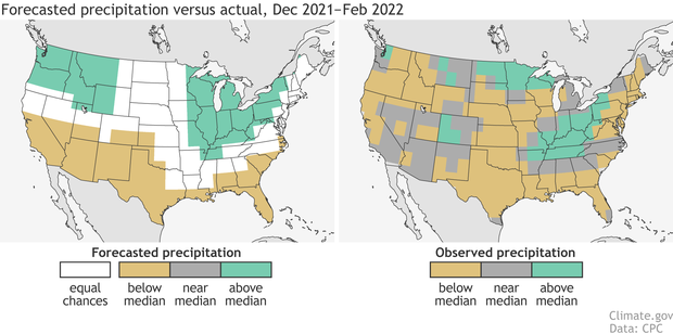
(left) Precipitation forecast for December-February 2021-22, made in mid-November. The colors show the forecast category with the highest probability. White areas are where all three outcomes (wet, dry, average) were equally likely (each had a 33.3% chance of happening). (right) Observed precipitation category for December-February 2021-22. Climate.gov image based on CPC data.
Overall, the precipitation outlook was not bad, either. The southern tier was, in fact, drier than average, with a wetter-than-average winter for many locations around the Great Lakes. The major differences lay in simply how much of the country observed a drier-than-average winter, along with a general dry signal over the Pacific Northwest.
The HSS for precipitation, though, was a solid 13 which rose to 21 if we only looked at locations where the outlook favored one category over the others. That makes eight of the last ten and 15 in the last 20 where the winter precipitation outlook had a positive HSS, or performed better than a random forecast. Again, illustrative of the need to play the long game with climate outlooks, but also an indication that most winter outlooks perform reasonably well.
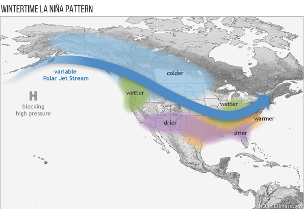
Average location of the jet stream and typical temperature and precipitation impacts during La Niña winter over North America. Map by Fiona Martin for NOAA Climate.gov.
Tell you more about this past winter? Don’t mind if I do
When there is an ENSO event, the conversation about the winter season inevitably includes a schematic like the one above, giving a general sense of the patterns seen during the course of the season. This may give the impression that (A) this is how every La Niña winter looks and (B) this is how every day/week/month of winter will look. Both are incorrect.
La Niña is not the only game in the climate town, meaning that each individual event is a unicorn unto itself. Temperature and precipitation patterns for each event can differ wildly, even if the “average” impacts look like the schematic above. This point is made best by the graphics found in these two articles.
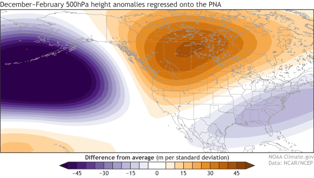
December-February 500-hPa geopotential height anomalies regressed onto the monthly PNA index (available here). Data shown for 1979-80 to 2018-19. Purple shading indicates below-average pressure and winds that flow counter-clockwise following the contours. Orange shading denotes above-average pressure and winds that flow clockwise. Climate.gov map using NCEP/NCAR reanalysis data.
Also, even patterns within a winter can be quite different. As Emily pointed out in February, there was a big swing in the atmosphere between December and January, which can be seen in the shift in the Pacific-North American pattern (or the PNA), a major atmospheric circulation pattern that has an outsized influence on North American weather. The negative phase, which has higher pressure south of Alaska and lower pressure over Canada, occurs more often on a seasonal timescale during La Niña (5).

The daily Pacific North American (PNA) Pattern index from December 1, 2021 - March 15, 2022. Positive numbers indicate that the PNA was in the positive phase, while negative numbers indicate the PNA was in the negative phase. There was a shift from a mainly negative PNA in December 2021 to a positive phase PNA in 2022. Climate.gov image using data from NOAA Climate Prediction Center.
After a record negative PNA pattern in December, a month where epic amounts of precipitation fell in California, the PNA shifted to its positive state for the final two months of meteorological winter, and precipitation basically shut off for California. You may be thinking “Whaaa?? I thought La Niñas are associated with a negative PNA! What gives?” They are! But that doesn’t mean there can’t be shifts within a winter. In fact, there have only been three La Niñas back to 1950 where every month of the winter had a negative PNA, and the most recent one was the winter of 1971-1972. Heck, there’s even been one La Niña winter where each month had a positive PNA (2011-2012).
As I note, and as Emily noted that Michelle noted previously (ENSO Blog Inception!), random chaotic weather fluctuations, or internal variability, can often determine the state of the PNA. Which also means that the PNA pattern can change quickly and its relationship to ENSO is weaker at timescales shorter than a season. The climate is complicated y’all!
Bring us on home, Tom!
Given how complicated climate can be, it just goes to show how well the Climate Prediction Center’s Winter Outlooks have performed over the past twenty years. The weather will always have the final say over the small-scale intricacies of the winter temperature and precipitation patterns year in year out. But the broader patterns year after year are what we are looking for. And it’s clear that so far, the outlooks have been winning that long game.
Footnotes
1) Still confused? Here’s an example. For any point on the winter temperature outlook map, there are actually three temperature forecasts being made: one for the chance for above-average temperatures, one for the chance of below-average temperatures, and one for the chance of near-average temperatures. When added together, the probabilities will equal 100%.
2) A reminder, this post is verifying against the Winter Outlook made in November 2021.
3) Why? Well, there are a lot of things that can affect seasonal patterns. Some of them are more predictable (hint: ENSO, climate trends) than others (random weather, other climate phenomena). And even the most predictable things are no guarantees. Hence the reason why probabilities are the key to climate outlooks.
4) The HSS equation is HSS = 100*(H-E)/(T-E), where H is the number of correct forecasts, E is the expected number of correct forecasts by luck, and T is the total number of forecasts. A score of 100 means a perfect forecast, a score greater than zero means a forecast is better than expected from luck, and a score of -50 means the forecast was completely wrong with the favored category not occurring anywhere on the map.
5) The positive phase of the PNA is associated with the opposite of the negative phase, meaning below-average pressure over the North Pacific and above-average pressure over northwestern North America. It is also occurs more frequently than normal during El Niño.
A blog about monitoring and forecasting El Niño, La Niña, and their impacts.
Disclaimer:
The ENSO blog is written, edited, and moderated by Michelle L’Heureux (NOAA Climate Prediction Center), Emily Becker (University of Miami/CIMAS), Nat Johnson (NOAA Geophysical Fluid Dynamics Laboratory), and Tom DiLiberto and Rebecca Lindsey (contractors to NOAA Climate Program Office), with periodic guest contributors.
Ideas and explanations found in these posts should be attributed to the ENSO blog team, and not to NOAA (the agency) itself. These are blog posts, not official agency communications; if you quote from these posts or from the comments section, you should attribute the quoted material to the blogger or commenter, not to NOAA, CPC, or Climate.gov.
Source: ENSO blog team
