


December 2, 2023 - By Nat Johnson - After the last three winters of La Niña conditions (weren’t we all ready for a change!), the tropical Pacific is looking much different this year, with a strong El Niño likely this winter (1). Historically, how has El Niño shaped precipitation (rainfall + snowfall) over the U.S.? Let’s dig in and find out!
What happened during December-February for previous strong El Niños?
For the 7 strongest El Niño events since 1950, wetter-than-normal conditions occurred along the West Coast and southern tier of the U.S., especially in the Southeast. This is expected because El Niño causes the jet stream to shift southward and extend eastward over the southern U.S. However, there are clearly some differences among the events if you look at the details in the maps. For instance, the 2015-16 and 1957-58 strong El Niños were not as wet as expected over the southern U.S. and were even dry in some locations. What is the story there?
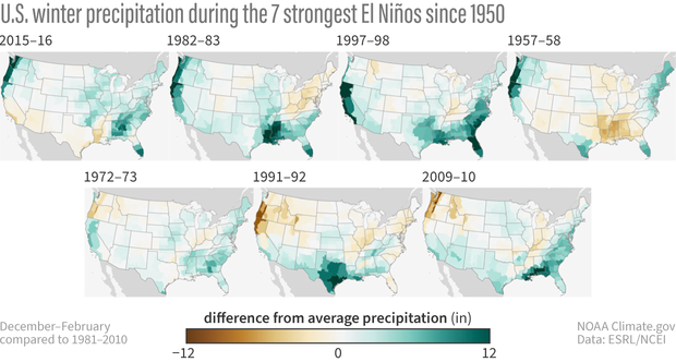
U.S. winter (Dec-Feb) precipitation compared to the 1981-2010 average for the past 7 strong El Niño events. Details differ, but most show wetter-than-average conditions across some part of the South. NOAA Climate.gov image, based on data from NOAA Physical Science Lab online tool.
The devil is in the details
When forecasters put together a prediction, one consideration is the forecasts generated by climate models, such as from the North American Multi-Model Ensemble (NMME). You might think that the NMME produces a single forecast map for the upcoming winter, but nope! Each month, the NMME produces hundreds of forecast maps from several different models. Why so many maps? Well, the short version of the story is that the chaos of weather can have big consequences for our seasonal predictions (head over to footnote #2 if you would like a few more details). We cannot possibly say what the weather will be like on January 1st based on model forecasts that were made in early November. So, by running models many times, we are simulating a lot of different possible “weather outcomes” that can occur over a season.
The easiest way to examine these model predictions is not by staring at hundreds of maps (trust me, we’ve tried), but rather by examining the average of all the maps (this is called an “ensemble mean”). The average isolates the seasonal forecast signal (like El Niño) while removing the noise of chaotic weather. This map of forecast averages (3) is shown in the top left panel below, and because we are expecting a strong El Niño this winter, the map, not surprisingly, bears a striking resemblance to the expected winter El Niño precipitation pattern to its right (4).
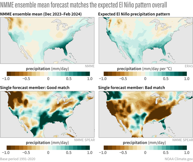
(top, left to right) The precipitation forecast for this coming winter (Dec-Feb 2023-24) based on the average of all the individual models in the North American Multi-model Ensemble forecast system. The geographic pattern of precipitation we'd expect based on averaging past El Niño winters from 1952-2022. (bottom, left to right) An individual model forecast that is a reasonably good match to the expected pattern. An individual model forecast that deviates significantly from the typical pattern. NOAA Climate.gov image, based on analysis by Nat Johnson.
However, this is a bit misleading because, as just noted, there are actually hundreds of forecasts, and this map is just an average of all of them! We know, because of chaotic weather, that the upcoming reality could more closely mimic any of the hundreds of individual forecasts. And these forecasts can differ considerably from each other.
For example, the map in the bottom left represents one forecast that looks quite similar to the NMME average. On the other hand, the forecast to its right, which was taken from the same model from the same starting month with basically the same El Niño, has almost the opposite pattern! And we cannot rule out either outcome actually happening for the upcoming winter!
This, in a nutshell, is the curse of internal variability. Basically, a single model, run forward with slightly different initial states, can lead to very different forecasted outcomes for the upcoming El Niño winter.
So, what’s the point of a making winter predictions?
If I’m basically saying that anything can happen this winter, then why do we bother to produce seasonal predictions? Well, as we have emphasized on the blog, although almost anything can happen in a given winter, El Niño or La Niña can tilt the odds in favor of a particular outcome, meaning that those hundreds of predictions may lean in a certain direction. Additionally, the stronger the El Niño, the more likely the U.S. winter precipitation pattern will match both the average of the computer model forecasts and the typical El Niño precipitation pattern. Because there are higher chances in certain outcomes (e.g., a wetter winter), the presence of El Niño can help users assess risk and make plans.
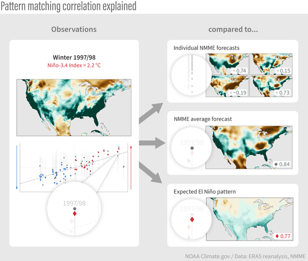
One way to evaluate forecast skill is pattern matching—an overall correlation "score" that describes how well the actual winter precipitation (such as the precipitation for winter 1997-98, a strong El Niño year, at left) matched individual model forecasts (top right), the NMME average (middle right), or the typical El Niño pattern (lower right). A score of 1 means a perfect match, a score of 0 means no matches at all, and a score of -1 means an inverse match, or a mirror image, such as you might expect to see during a La Niña winter. NOAA Climate.gov image, adapted from original by Michelle L'Heureux and Nat Johnson.
Not convinced yet? We can put my claim to the test by assessing how well the typical or expected El Niño winter precipitation pattern matched up with what actually occurred for past winters. We can do that by examining all previous U.S. precipitation forecasts produced by the NMME, the hundreds of individual forecasts and the multi-model average, for all past winters from 1983-2022. The schematic above breaks down these evaluations.
I have taken every winter precipitation pattern from this period (like the 1997/98 winter pattern shown on the left) and calculated how well that pattern matched the individual NMME forecasts for that winter (top right), the NMME average forecast (middle right), and the expected El Niño precipitation pattern (bottom right) (5). The values in this evaluation (6) range from -1 to +1, with values closer to +1 indicating a good match with the actual observed pattern, values near 0 indicating no match, and negative values closer to -1 indicating an inverse match (“mirror image”). All these calculations for all 40 winters are presented in a single plot and arranged from left to right according to the strength of the La Niña (strongest farthest left) or El Niño (strongest farthest right), as shown in the bottom left of the schematic.
Show me the data!
There’s a lot to take in from these comparisons, but there are three main takeaways. We’ll break it down into a sequence of three steps, starting with a focus on the NMME forecast performance.
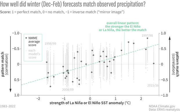
Correlations (pattern match "scores") between forecasts from the North American Multi-model Ensemble (NMME) and observed precipitation for all winters (Dec-Feb) from 1983-2022. Each column shows scores for individual models (small gray dot) and the score for the ensemble average (dark gray dot). Instead of being arranged chronologically, winters are placed from left to right based on the strength of the sea surface temperature (SST) anomaly in the tropical Pacific Niño-3.4 region that winter. Sorting this way shows the overall linear pattern: forecast scores get better (closer to 1, a perfect match) the stronger the La Niña or El Niño. NOAA Climate.gov figure, based on analysis by Nat Johnson.
The first plot in this sequence reveals two of the main takeaways.
- The stronger the El Niño or La Niña, the more likely that the actual winter pattern will match the average model forecast pattern. This is why seasonal predictions work, and why we care so much about ENSO! This point is made by the upward slope of the green dashed line in the figure, which represents the tendency for the average model forecast to perform better at stronger Niño-3.4 index values. In fact, by this metric, the forecasts have performed quite well for most (but not all! – more on that below) moderate-to-strong El Ninos.
- For a given winter forecast, chaotic weather causes a wide range of performance among individual model forecasts. This second takeaway, which causes the most wailing and gnashing of teeth among forecasters and their users, is brought out by the vertical stripes that represent the performance from individual model forecasts. In fact, for a given winter, there are usually some forecasts that perform quite well and some that perform quite poorly, even though there are no major differences in the models’ ENSO forecast between the high- and low-performing forecasts. Instead, the main difference is what we saw in those two forecast maps above: unpredictable, chaotic weather. Unfortunately, it’s likely impossible to distinguish those high- and low-performing model forecasts well in advance. Again, that’s the curse of internal variability.
In the second step of this sequence, we now include with red and blue diamonds how well the observed precipitation pattern matched the expected El Niño or La Niña precipitation pattern.
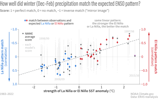
Correlations (pattern match "scores") between winter (Dec-Feb) precipitation and the geographic pattern we'd expect during El Niño (red diamonds) and La Niña (blue diamonds) based on composites of past events. The overall linear pattern is similar to the pattern shown in the figure above: the match between observations and the expected pattern get better (closer to 1, a perfect match) the stronger the La Niña or El Niño. NOAA Climate.gov figure, based on analysis by Nat Johnson.
This addition reveals the third takeaway.
- The average model forecast closely resembles the “expected” El Niño/La Niña precipitation pattern for most winters. This point comes out when we consider that that the dark grey circles representing the average model forecasts, are usually close to the red or blue diamonds that represent the El Niño (right) or La Niña (left) precipitation pattern for a given Niño-3.4 index value. This is the models’ way of agreeing with what we’ve been claiming at the ENSO Blog for years: ENSO is the major player for predictable seasonal climate patterns over the U.S. If there were another more important source of predictability, we would expect a bigger separation between those colored diamonds and the dark grey dots.
The comparison between the two biggest previous El Niños in this record, the winter of 1997/98 (a forecast success) and 2015/16 (widely regarded as a forecast “bust,” or how forecasters generally describe a bad forecast), are a great illustration of this final point. Check out footnote #7 for the details, but the upshot is that the influence of chaotic weather variability could have reduced the 1997/98 forecast performance much more than it did, and it likely was a factor in why the 2015/16 forecast performed so much worse.
Finally, let’s put these comparisons in the context of the forecast for the upcoming winter.
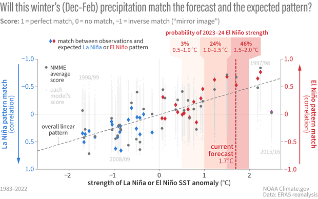
Two kinds of correlation scores: gray dots show how well the NMME forecasts (light gray dot=individual models, dark gray=average) matched actual winter precipitation; diamonds show how well the observed precipitation matched the geographic pattern we'd expect from averaging past La Niña (blue) or El Niño (blue) winters. The overall linear pattern is similar for both: pattern matches get better (closer to 1, a perfect match) the stronger the La Niña or El Niño. This winter's forecast for a strong El Niño means the winter has a higher chance of matching—on average for the U.S.—the typical El Niño pattern. NOAA Climate.gov figure, based on analysis by Nat Johnson.
The likelihood of a strong El Niño increases the chance that the precipitation pattern for the upcoming winter will match both the NMME average and the expected El Niño pattern reasonably well, but, as I have been emphasizing, we cannot rule out the possibility that reality will have other plans.
That’s awfully convenient!
At this point, you might be saying, “Hold on, Nat, you’re telling me that ENSO is the main driver of the winter precipitation outlook, and if it busts, we can just blame it on the noise of chaotic, unpredictable weather? That sounds like a cop-out (and a little suspicious coming from a writer for the ENSO Blog).” That’s a fair question! As scientists, we need to continuously reevaluate our assumptions, check for blind spots, and tirelessly strive to improve our understanding of our forecast models. I can assure you that these efforts are being made, especially when the seasonal conditions deviate from expectations, and hopefully they will lead to better seasonal predictions with higher probabilities.
The main point I’m trying to make, however, is that when a forecast busts, it isn’t necessarily because there is a clear reason, a model bug, or a misunderstanding of the drivers. It could just be because there is a certain amount of unpredictable chaotic weather that we cannot predict in advance. That means that we must remember that seasonal outlooks are always expressed as probabilities (no guarantees!) and that we need to play the long game when evaluating seasonal outlooks – a single success or bust is not nearly enough.
The official CPC seasonal outlook for this upcoming 2023-24 winter has been updated and you can find it here. We need to keep in mind that other climate phenomena (e.g., MJO, polar vortex) that could shape conditions this winter are mostly unpredictable for seasonal averages, but are more predictable on the weekly to monthly time horizons (8). That means you may want to consider shorter-range forecasts, like CPC’s Monthly, Week 3-4, 8 to 14 Day, and 6 to 10 Day outlooks. We at the ENSO Blog will be closely monitoring how conditions evolve this winter, and we’ll be sure to keep you updated!
Footnotes
- Following the description in Emily’s post, we consider El Niño to be strong when the Oceanic Niño Index for the season exceeds 1.5° C. As of CPC’s November ENSO forecast update, the probability that the Oceanic Niño Index will exceed 1.5° C for December – February 2023/24 is 73%.
- One of the main sources of uncertainty in our seasonal predictions stems from the state of our climate system (ocean, land, and atmosphere) at the start of a forecast (“initial conditions”). Why does this matter? Well, we do not perfectly observe and understand the current oceanic, land, and atmospheric conditions over the entire globe at any single moment in time. Because of this uncertainty at the very start of a forecast, we run prediction models from slightly different starting conditions, making hundreds of different predictions at any one time (“an ensemble of many different members”). Those tiny differences in starting conditions can lead to very distinct seasonal predictions through the chaos of weather (as Emily wrote, think of a difference equating to a flap of a butterfly’s wings in Brazil at the start of a forecast leading to a tornado forming in Texas several weeks later). Another source of uncertainty is the imperfect way that climate models represent physical processes relevant for our weather and climate. Although that is not the focus of this post, it’s the main reason why the NMME is a combination of many different models – the multi-model average tends to filter out the errors of individual models and produce a more accurate forecast.
- Specifically, I averaged all the forecasts produced in September, October, and November of this year from 7 different models. Each model has a set of forecasts (ranging from 10 to 30) with slightly different initial conditions to sample the different possible realizations of chaotic weather variability. By taking the average of all forecasts, we tend to average out the effects of chaotic weather variability and isolate the predictable seasonal forecast signal. The NMME precipitation map was produced by averaging 324 individual forecast maps (108 for each of September, October, and November). You might ask, why don’t I just use the latest (November) forecast? Well, the more maps that I average, the more I can average out that chaotic weather and perhaps some of the individual model errors. It turns out that the average of these three months produces a precipitation forecast that performs slightly better than the November forecast.
- I calculated the “typical winter El Niño precipitation pattern” as the linear regression of December-February precipitation anomalies on the Niño-3.4 index from 1952-2022. Because of the method that was used, we can just flip the sign of the precipitation anomalies in the map to get the “typical winter La Niña precipitation pattern.” The map is scaled by the December-February Niño-3.4 index, so we would multiply this map by the Niño-3.4 index to get the expected precipitation anomaly amplitudes for that winter (i.e., the stronger the El Niño, the stronger the expected precipitation anomalies).
- If the Niño-3.4 index was less than zero for that winter, then the forecast would be compared with the expected La Niña precipitation pattern, which would be the same spatial pattern as the El Niño pattern but with anomalies of opposite sign. The method for calculating this pattern is described in the previous footnote.
- Specifically, I am evaluating the forecasts with a pattern correlation, which is a metric we have used before on the blog (like here).
-
The U.S. precipitation pattern correlation analysis shows that the average 1997/98 NMME forecast, which featured a classic El Niño precipitation pattern, performed very well (pattern correlation exceeding 0.8, as shown in the schematic) and likely helped to shape expectations for the major El Niño that occurred in 2015/16. The precipitation pattern in 2015/16, however, didn’t materialize as expected, especially in California, and that winter precipitation forecast was widely panned as a bust for that region.
The analysis confirms that the average NMME forecast in 2015/16, which again resembled the classic El Niño pattern, performed unusually poorly for a strong El Niño, with a pattern correlation near zero. There are many studies that have attempted to address what contributed to the unusual pattern in 2015/16, but this figure reveals that chaotic weather may have been a major factor. In particular, we see that many individual forecasts in 2015/16 performed much better than the average (check out some of the individual forecasts with pattern correlations greater than 0.5), even better than many individual forecasts in 1997/98. This suggests that the influence of chaotic weather variability did not harm the 1997/98 forecast nearly as much as it could have, but it likely was a factor in why the 2015/16 forecast performed so much worse.
For a very good detailed and technical discussion on the challenges of seasonal precipitation prediction over California, I recommend Kumar and Chen (2020). Also, check out Tom’s previous post on the topic.
- We have covered many of these phenomena on the ENSO Blog, including sudden stratospheric warmings, the Madden-Julian Oscillation (MJO), the Arctic Oscillation/North Atlantic Oscillation, the North Pacific Oscillation-West Pacific teleconnection, and the Pacific/North American pattern.
A blog about monitoring and forecasting El Niño, La Niña, and their impacts.
Disclaimer:
The ENSO blog is written, edited, and moderated by Michelle L’Heureux (NOAA Climate Prediction Center), Emily Becker (University of Miami/CIMAS), Nat Johnson (NOAA Geophysical Fluid Dynamics Laboratory), and Tom DiLiberto and Rebecca Lindsey (contractors to NOAA Climate Program Office), with periodic guest contributors.
Ideas and explanations found in these posts should be attributed to the ENSO blog team, and not to NOAA (the agency) itself. These are blog posts, not official agency communications; if you quote from these posts or from the comments section, you should attribute the quoted material to the blogger or commenter, not to NOAA, CPC, or Climate.gov.
Source: ENSO blog team
