


November 11, 2023 - By Emily Becker - El Niño is currently chugging along, and forecasters expect it to continue for the next several months, with a 62% chance of lasting through April–June 2024. Since we’re heading into the winter, when El Niño’s effect on Northern Hemisphere temperature and rain/snow is most distinct, today we’ll drive by some of El Niño’s wide-ranging impacts.
On rails
First stop—this El Niño has now met the threshold for a “strong” event! The August–October Oceanic Niño Index, which measures the three-month-average sea surface temperature in the east-central tropical Pacific (the so-called Niño-3.4 region), was 1.5 °C above the long-term average (long-term is currently 1991–2020). The Oceanic Niño Index is our primary metric for ENSO (El Niño/Southern Oscillation, the entire El Niño and La Niña system). The monthly Niño-3.4 Index was 1.7 °C above average.
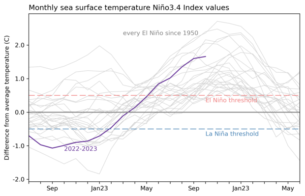
2-year history of sea surface temperatures in the Niño-3.4 region of the tropical Pacific for all events evolving into El Niño since 1950 (gray lines) and the current event (purple line). NOAA Climate.gov image based on a graph by Emily Becker and monthly Niño-3.4 index data from CPC using ERSSTv5.
“Strong” here is in quotation marks because we don’t have an official definition of ENSO strength. Our unofficial thresholds for the strength of an El Niño event are an Oceanic Niño Index of 0.5–0.9 °C for weak, 1.0–1.4 °C for moderate, and above 1.5 °C for strong. Over 2.0 °C is considered “very strong,” or “historically strong.” I’m going to drop the quotation marks going forward, because they slow us down, and we’re motoring here!
We started noting the potential for a strong El Niño way back in April 2023, before El Niño had even arrived (that happened in June). Currently, forecasters estimate a greater than 55% chance that El Niño will remain above that threshold for strong through January–March 2024. There’s about a 1-in-3 chance that the Oceanic Niño Index will reach 2.0 °C, which has happened four times before in our 73-year record: 1972-73, 1982–83, 1997–98, and 2015–16.
Why does the strength of an El Niño matter? I’ll get to that. First, though, let’s cruise through the reasoning behind the forecast.
I’m on a boat
During an El Niño event, both the tropical Pacific Ocean surface and the atmosphere exhibit characteristic changes. The ocean surface is warmer than average, as I discussed above. Without El Niño, the usual atmospheric pattern, the Walker circulation, consists of rising air and storms over the far western Pacific, west-to-east winds high up in the atmosphere, descending air over the cooler eastern Pacific, and the trade winds, east-to-west winds near the surface.
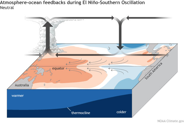
ENSO-Neutral or average conditions across the tropical Pacific Ocean. Climate.gov schematic by Emily Eng and inspired by NOAA PMEL.
El Niño’s warmer-than-average central and eastern Pacific weaken this pattern, leading to less rain over the far western Pacific, more in the central, and sometimes eastern, Pacific, and weaker trade winds.
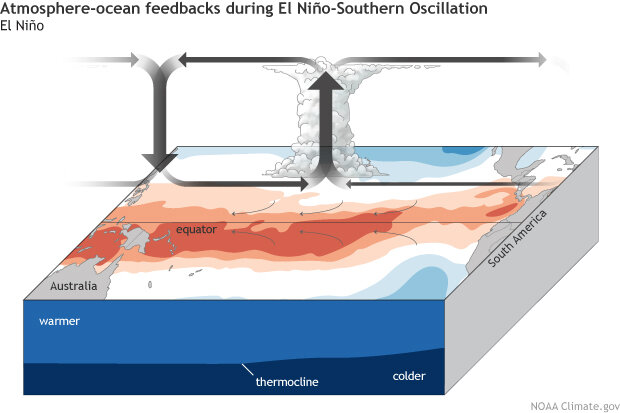
El Niño feedbacks between the ocean and atmosphere. During El Niño, the eastward expansion of the convection and rainfall will depend on how warm the absolute sea surface temperatures becomes in the eastern Pacific. This means that during weaker El Niño events, we may only see convection and rainfall increase around the Date Line. But during stronger El Niño events, the increase in convection and rainfall can potentially extend from the Date Line all the way to coastal Ecuador/Peru in South America. Climate.gov schematic by Emily Eng and inspired by NOAA PMEL.
We’ve observed all of these characteristics of the weaker Walker circulation lately, indicating that El Niño’s engine is fully engaged.
The weaker trade winds help to continue and potentially strengthen the ocean surface temperature changes. Under average conditions, consistent trade winds drag across the surface and keep warm water piled up in the far western Pacific. When they weaken, warm water can start to slosh eastward under the surface, in a downwelling Kelvin wave. These waves can take a few months to travel across the Pacific, providing a source of warm water to continue powering the surface warming. Recently, we’ve seen evidence of increased warm water under the surface of the central tropical Pacific, and it appears another downwelling Kelvin wave is in progress.
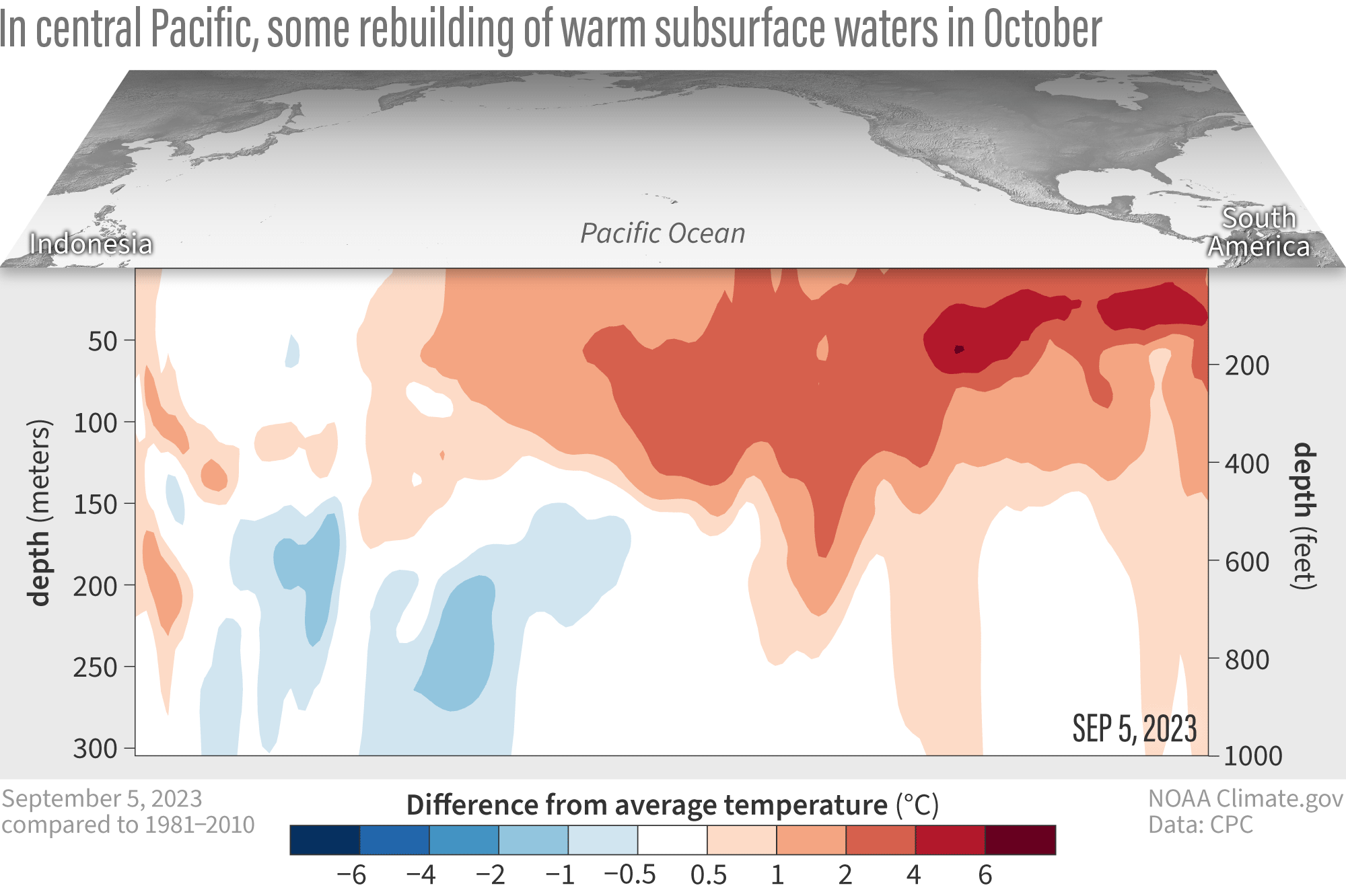
Water temperatures in the top 300 meters (1,000 feet) of the tropical Pacific Ocean compared to the 1991–2020 average in September–October 2023. NOAA Climate.gov animation, based on data from NOAA's Climate Prediction Center.
Similar to last month, the amount of warm water under the surface isn’t quite up to the October levels seen during the strong El Niño events in 1982, 1997, or 2015. For visuals, you can check out the scatter plot of September values from last month’s blog post, or look at the subsurface cross-sections from October 2023, 1982, 1997, and 2015. However, another downwelling Kelvin wave would increase the subsurface temperature anomalies in the eastern Pacific.
Airplane!
The strength of an El Niño event matters because the stronger the event, the more likely that we’ll see the characteristic changes in temperature, rain and snow, and other impacts. It doesn’t necessarily mean that the impacts themselves will be so much stronger, but it makes the expected El Niño impacts more likely to happen. Of course, where the weather is concerned, there are no guarantees! However, a stronger El Niño makes it a safer bet that we’ll see the expected patterns.
We’ve written a fair bit about El Niño impacts in our 9.5 years here at the ENSO Blog. Let’s buzz through a few:
- Just a couple weeks ago, Michelle covered El Niño + snow patterns.
- If you’re interested in how El Niño affects the jet stream, check out my recent post.
- How about El Niño and coastal flooding?
- When I was going nuts from writing about La Niña for three years in a row, I looked into how El Niño (and La Niña!) change the range of winter daily temperatures.
- Here’s a great guest post by Dr. Amy Butler about El Niño and the stratospheric polar vortex.
- Thinking about hopping a flight to Hawaii? Find out about ENSO and Hawaii, courtesy of Nat.
- Hawaii’s too warm for you? Here’s a guest post by Brian Brettschneider on ENSO and Alaska!
- This El Niño has a decent chance of hanging around through March–May, when it could play a role in reducing tornadoes and hail in the south and southeast U.S.
- Tom’s post on the complicated relationship between ENSO and the Indian monsoon is evergreen.
- Does El Niño increase atmospheric rivers? Nat and his colleague Kai-Chih Tseng investigate.
- El Niño impacts global health? Yep! Nat has the scoop.
- For the Australian perspective on El Niño, here’s a post by Andrew Watkins.
Dogsled
Our Alaskan friend-of-the-blog, Brian Brettschneider, was kind enough to provide us with maps that show how winter in North America turned out during past El Niños (there have been 29 since 1950) turned out (see footnote). For example, El Niño winters in Florida have more often been wetter (green) than average, while the Midwest has seen more drier-than-average (brown) El Niño winters.
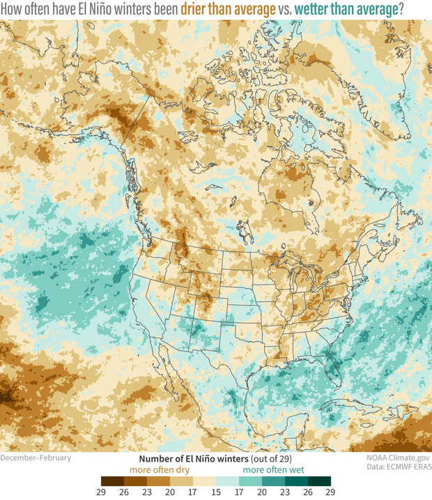
This is not your typical "winter impacts of El Niño" map. It shows the frequency of wet (green) or dry (brown) winters (December-February) across North America during the 29 El Niños from 1940-2022. Places where more than half the El Niño winters were wetter than average by any amount are colored green. (Whether a winter was above- or below-average was based on comparison with a 30-year rolling average centered on the winter in question.) Places where more than half the El Niño winters were drier than average by any amount are colored brown. Much of the southern United States is light or medium green, meaning that wetter-than-average winters were slightly more common than drier-than-average winters. Across the northern part of the contiguous United States, drier-than-average winters slightly outnumbered wet ones. NOAA Climate.gov map, based on analysis of ERA5 data by Brian Brettschneider.
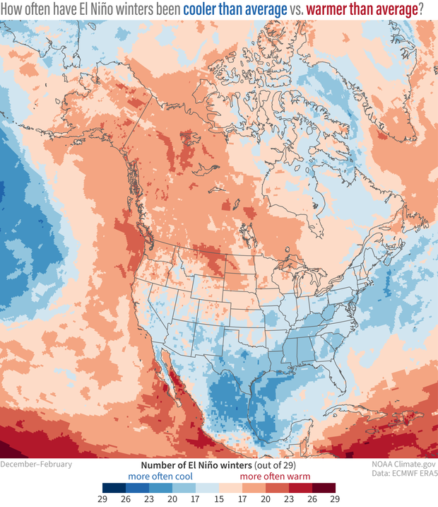
This is not your typical "winter impacts of El Niño" map. The colors show the frequency of cold or warm winters during the 29 El Niños that occurred from 1940-2022. Places where more than half (15 or more) the El Niño winters were cooler than average by any amount are colored blue. (Whether a winter was above- or below-average was based on comparison with a 30-year rolling average centered on the winter in question.) Places where more than half the El Niño winters were warmer than average by any amount are colored red. Most of the United States is light or medium blue, meaning that cooler-than-average winters were slightly more common than warmer-than-average winters. NOAA Climate.gov map, based on analysis of ERA5 data by Brian Brettschneider.
Northwestern North America has seen more warmer (red) than average El Niño winters, and the states around the Gulf of Mexico have been cooler (blue) more often. What do you see? Let us know in the comments!
That’s today’s trip through the wonderful world of ENSO. See you next month!
On foot(note)
Rebecca wrote a piece about the summer version of these maps. The maps are based on the “ERA5” reanalysis from the European Center on Medium-range Weather Forecasting, which covers the global climate from January 1940 to the present. A reanalysis is when scientists use a climate model to fill in gaps in past observations. Many observational records are incomplete, due to stations moving, being discontinued, or missing data. Using a climate model, we can connect the dots between missing data and create a continuous record of the past climate. Reanalysis is an invaluable, widely used technique.
A blog about monitoring and forecasting El Niño, La Niña, and their impacts.
Disclaimer:
The ENSO blog is written, edited, and moderated by Michelle L’Heureux (NOAA Climate Prediction Center), Emily Becker (University of Miami/CIMAS), Nat Johnson (NOAA Geophysical Fluid Dynamics Laboratory), and Tom DiLiberto and Rebecca Lindsey (contractors to NOAA Climate Program Office), with periodic guest contributors.
Ideas and explanations found in these posts should be attributed to the ENSO blog team, and not to NOAA (the agency) itself. These are blog posts, not official agency communications; if you quote from these posts or from the comments section, you should attribute the quoted material to the blogger or commenter, not to NOAA, CPC, or Climate.gov.
Source: ENSO blog team
