


August 12, 2023 - By Emily Becker - It’s that time again! And by “that time,” I mean the El Niño forecast update, of course. The chance that El Niño—the warm phase of the El Niño Southern Oscillation (aka “ENSO”) climate pattern—will continue through the winter is greater than 95%, so let’s sharpen our pencils and get into the details of what that means for upcoming seasons.
Mathematics
Greater than 95% is a very strong chance! Forecasters’ confidence that El Niño will continue is based on a few factors. First, the east-central tropical Pacific is quite warm. Specifically, our primary El Niño-monitoring metric, the Niño-3.4 Index—the average sea surface temperature in the Niño-3.4 region in the east-central tropical Pacific—was 1.0 °Celsius (about 2 °Fahrenheit) warmer than the long-term average in July, according to our most reliable dataset, ERSSTv5. (Long-term = 1991–2020.)
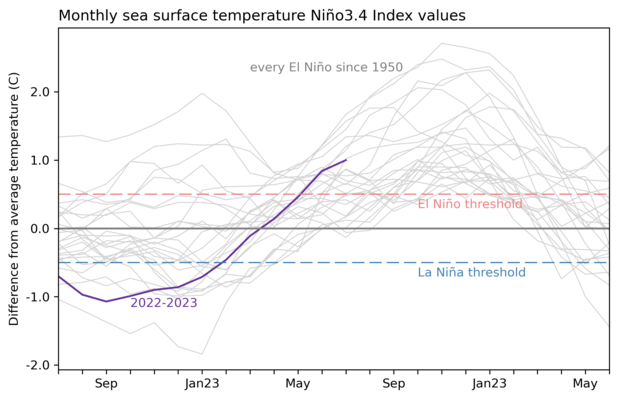
2-year history of sea surface temperatures in the Niño-3.4 region of the tropical Pacific for all events evolving into El Niño since 1950 (gray lines) and the current event (purple line). NOAA Climate.gov image based on a graph by Emily Becker and monthly Niño-3.4 index data from CPC using ERSSTv5.
The three-month-average Niño-3.4 Index, the Oceanic Niño Index, was 0.8 °C above the long-term mean for the May–July average, the second three-month-period in a row above the El Niño threshold of 0.5 °C. We need to see five consecutive three-month averages above this threshold before these periods will be considered a historical “El Niño episode” and colored red in our ENSO record). Two is a good start, especially with the 0.8 °C recording from May–July. If this El Niño were to collapse after hitting this high, dropping back below the threshold of this magnitude before next winter, it would be the first time in our historical record, dating back to 1950.
Social studies
El Niño is a coupled phenomenon, meaning the changes we see in the ocean surface temperature must be matched by changes in the atmospheric patterns above the tropical Pacific. The average atmospheric circulation over the tropical Pacific, the Walker circulation, is like a conveyor belt: rising air over the very warm far western Pacific, west-to-east winds high up in the atmosphere, descending air and dry conditions over the east-central Pacific, and returning east-to-west winds near the surface—the trade winds.
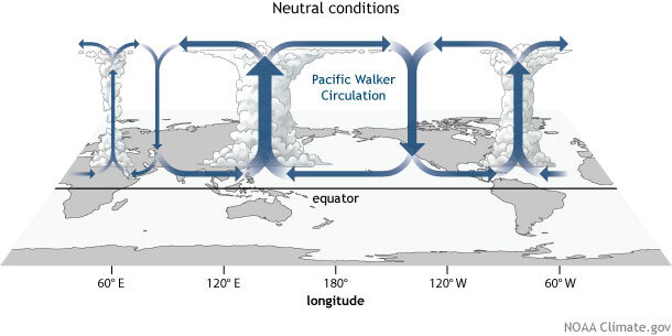
Generalized Walker Circulation (December-February) during ENSO-neutral conditions. Convection associated with rising branches of the Walker Circulation is found over the Maritime continent, northern South America, and eastern Africa. NOAA Climate.gov drawing by Fiona Martin.
During El Niño, the warmer east-central tropical Pacific Ocean surface leads to lower surface air pressure and more rising air, clouds, and rain over that region, weakening the overall circulation. The trade winds slow, and drier conditions and higher-than-average air pressure are observed over the western Pacific and Indonesia. The ocean-atmosphere coupling is both how El Niño perpetuates itself, as the atmospheric changes feed back into the oceanic changes, and how El Niño affects global weather and climate.
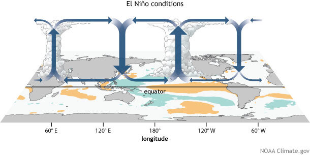
Generalized Walker Circulation (December-February) anomaly during El Niño events, overlaid on map of average sea surface temperature anomalies. Anomalous ocean warming in the central and eastern Pacific (orange) help to shift a rising branch of the Walker Circulation to east of 180°, while sinking branches shift to over the Maritime continent and northern South America. NOAA Climate.gov drawing by Fiona Martin.
In July, we observed more rain and clouds over the central Pacific, with somewhat drier conditions in Indonesia, and some reduced trade wind activity in the western Pacific. The Equatorial Southern Oscillation Index, which measures the relationship between surface air pressure across the Pacific, was -0.9 in July, indicating weaker pressure in the eastern Pacific and higher in the western. Taken together, these are all signs of the atmospheric component of El Niño, providing more confidence that the system is engaged and that these conditions will last through the winter.
Computer science
Our global climate models are predicting that the warmer-than-average Pacific ocean conditions will not only last through the winter, but continue to increase. There is a good chance—approximately 2 in 3—that the peak Oceanic Niño Index this winter will match or exceed 1.5 °C, our informal threshold for a “strong” El Niño event. This is more confident than last month, in large part because the peak of this El Niño is one month closer, and, as I mentioned above, the surface is already 1.0 °C warmer than average.
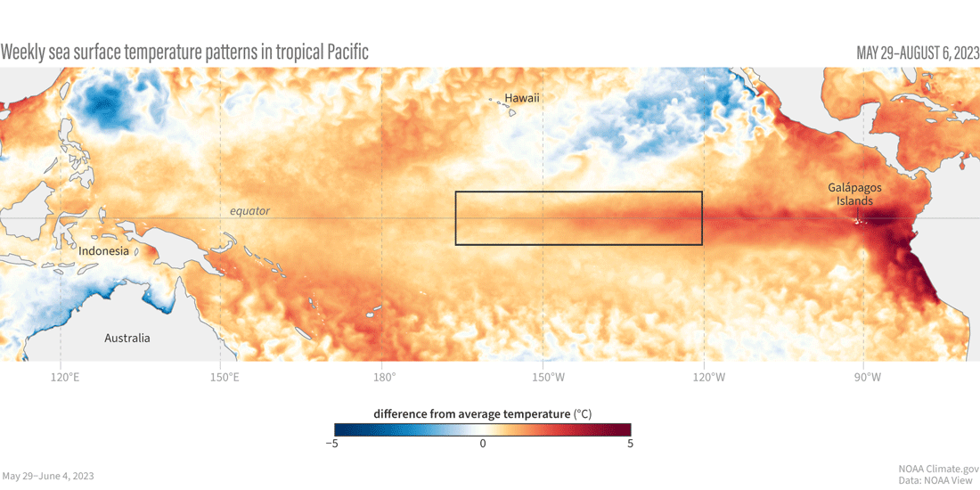
Animation of maps of sea surface temperatures in the Pacific Ocean compared to the long-term average over five-day periods from the end of May to early August 2023. The waters in the key monitoring region, which scientists call "the Niño-3.4 region," progressively become warmer than average (red) as El Niño builds. NOAA Climate.gov, based on Coral Reef Watch maps available from NOAA View.
The sea surface temperature changes associated with El Niño events usually peak in November–January or thereabouts. Why? We still don’t know exactly why ENSO’s seasonal cycle is timed the way it is, with most events peaking in the winter and decaying through the spring. There is still a lot to learn!
Geography
El Niño’s most extensive impacts on global climate also occur during the winter and early spring. (I’m using Northern Hemisphere seasonal terms here.) Typical impacts include more rain and storms across the southern tier of the United States, southeastern South America, around the horn of Africa, and eastern Asia. Drier conditions are often found in December–February during El Niño through the Maritime continent/Indonesia, southeastern Africa, and northeastern South America. El Niño affects summer (June–August) climate, too, including drier conditions through the Caribbean, Indonesia, India, northern South America, parts of Central America, and eastern Australia.
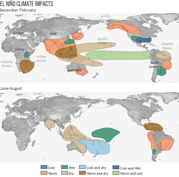
These maps show winter and summer global ENSO impacts.
El Niño is also known to interact with the Atlantic and Pacific hurricane seasons, with El Niño years tending to be less active in the Atlantic. In the hurricane season outlook released in May, NOAA scientists expected the potential suppressing effect of El Niño may be offset by the much warmer than average Atlantic Ocean surface, as warm water provides fuel for hurricanes. NOAA’s update to the outlook will be released later today, so be sure to keep an eye out for that!
Experimental psychology
Speaking of the warm Atlantic, you’ve probably heard about the recent unusually high global average temperatures. Some of the world’s oceans are extremely warm (North Atlantic, Southern Ocean, and so on), and there have been long-lasting heat waves across many land regions. El Niño is linked to higher global averages, although this El Niño is just getting going and can’t be blamed for all the heat events that have occurred already this year. (In fact, over North America, impacts tend to be very weak during the summer). There’s a good chance, though, that it will contribute to (at the very least) a top-3 average temperature for 2023. In a guest post in June, Karin Gleason discussed how NOAA predicts the global average temperature.
But what are the computer climate models predicting? Michael Tippett of Columbia University, noted friend-of-the-blog, took a look at some of the predictions from the North American Multi-Model Ensemble. These graphs are a lot, so bear with me!
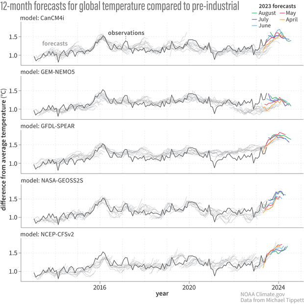
Global average temperature forecasts from the North American Multi-Model Ensemble, from an original by Michael Tippett of Columbia University. Each panel shows the forecast from one model, relative to the “pre-industrial” period—that is, the increase in global average temperature since 1850. The black line shows the observed global temperature, from the Hadley Center’s HADCRUT5 temperature record. The gray lines are forecasts starting in April, May, June, July, and August from previous years, starting in 2013. The most recent forecasts, from April, May, June, July, and August of 2023, are on the right-hand end, in colors. For most models, the forecasts extend out 12 months—for example, the forecast made in June 2014 goes out to May 2015. These forecasts have the same structure as our Niño-3.4 forecasts, but instead of predicting the average sea surface temperature in the Niño-3.4 region, they’re predicting the average temperature over the entire globe. For help visualizing the separate forecasts, take a look at this animation showing Niño-3.4 forecasts from 2015–16. Figure by climate.gov based on data from Michael Tippett, obtained from the IRI Data Library.
Each panel shows the global average temperature forecast from one model, relative to the “pre-industrial” period—that is, the increase in global average temperature since 1850. To see how the predictions vary from month-to-month, Mike has included forecasts made in April, May, June, July, and August of each year, starting in 2013. The most recent forecasts, from April, May, June, July, and August of 2023, are on the right-hand end, in colors.
The gray lines are forecasts from previous years. For most models, the forecasts extend out 12 months—for example, the forecast made in June 2014 goes out to May 2015. The black line shows the observed global temperature, from the Hadley Center’s HADCRUT5 temperature record. These forecasts have the same structure as our Niño-3.4 forecasts, but instead of predicting the average sea surface temperature in the Niño-3.4 region, they’re predicting the average temperature over the entire globe. (For help visualizing what I mean, take a look at this animation showing Niño-3.4 forecasts from 2015–16.)
The different models and the different monthly forecasts show that there is some variation in the predictions overall. Most models suggest that the global average temperature will substantially exceed that of early 2016, our last strong El Niño event, but not all of them. Month-to-month, the predicted average can shift around. You can also see that the 2016 record was pretty well predicted by the models. There are a lot of things to note in these graphs, but I’m running out of space here, so I leave you to your studies. What do you observe? Let us know in the comments!
A blog about monitoring and forecasting El Niño, La Niña, and their impacts.
Disclaimer:
The ENSO blog is written, edited, and moderated by Michelle L’Heureux (NOAA Climate Prediction Center), Emily Becker (University of Miami/CIMAS), Nat Johnson (NOAA Geophysical Fluid Dynamics Laboratory), and Tom DiLiberto and Rebecca Lindsey (contractors to NOAA Climate Program Office), with periodic guest contributors.
Ideas and explanations found in these posts should be attributed to the ENSO blog team, and not to NOAA (the agency) itself. These are blog posts, not official agency communications; if you quote from these posts or from the comments section, you should attribute the quoted material to the blogger or commenter, not to NOAA, CPC, or Climate.gov.
Source: ENSO blog team